Let’s Get Care
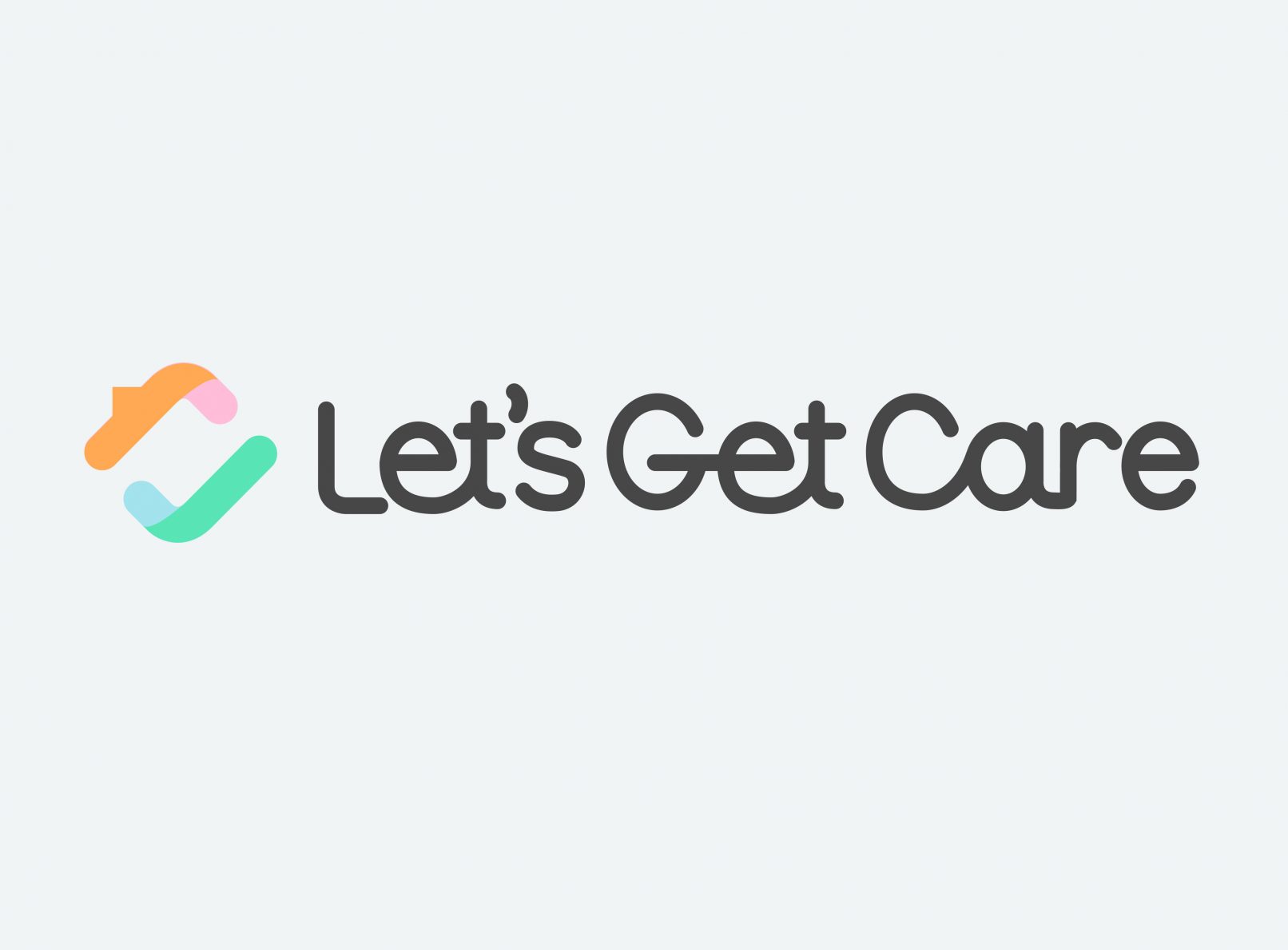
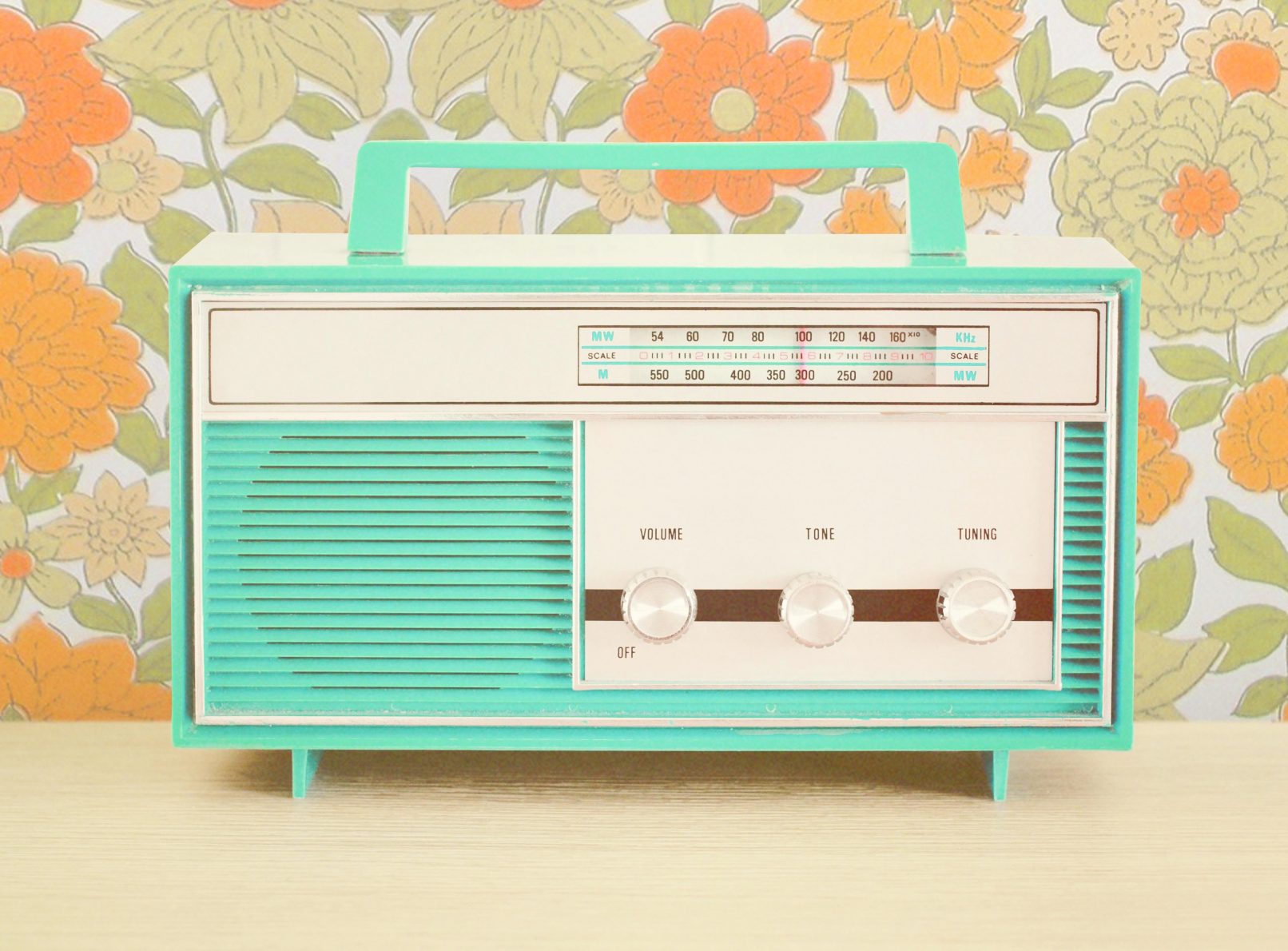
The brief for the Let’s Get Care brand was to create something that was nostalgic yet current and trustworthy yet unique. The final logo represents a roofline above and a tick below in soft retro colours. The shape is also seen in the letter L. The overall attitude is gentle and a little vintage while still clearly representing a modern company. Extensive branded collateral was created for Let’s Get Care including brochures, folders, business cards, advertising, illustrations, icons and interactive forms.


